
Colour psychology: A powerful interior design tool
Ever wondered why your feelings and emotions are effected by different environments? It may be that you instantly feel relaxed and at ease in a room that has been designed using natural woods and warm finishes. Or you feel surprisingly energised and optimistic when surrounded by bright, bolder aesthetics. This is most likely linked to colour psychology and how the design of a space has been intended to create a particular emotion or reaction from you – albeit subconsciously.
Colour psychology is used widely in branding and marketing but it’s also a powerful interior design tool that arguably has more of an impact on the mood of a room than any other factor.
Different shades evoke different emotions, so when debating on which hues to choose for your workplace, it’s key to consider the kind of atmosphere you want to create as well as the outcomes you intend to influence.
So what colours do you need in your workplace?
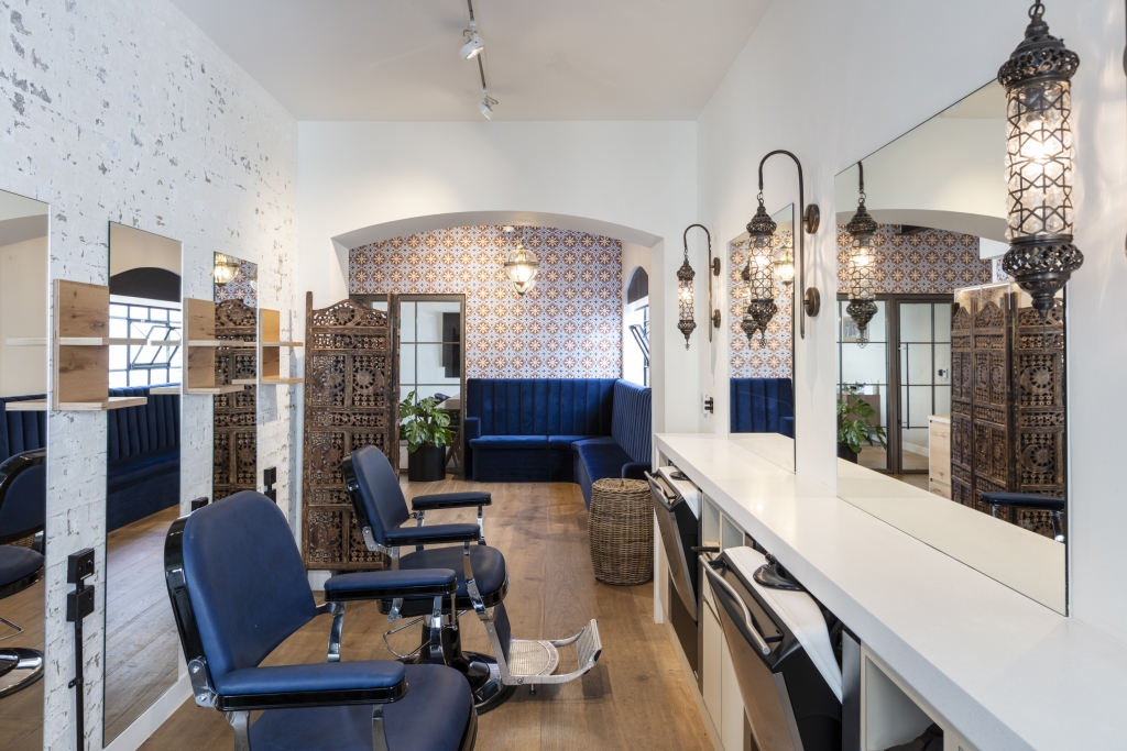
BLUE
Blue is often seen throughout nature, so is subconsciously associated with feelings of tranquility and stabilisation.
Using blue in areas such as meeting rooms or open plan spaces, can induce a sense of calmness which in turn helps to keep employees focused for longer periods of time.
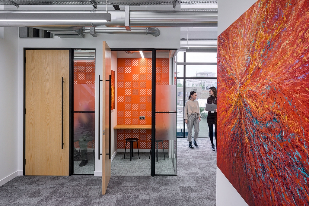
RED
Red evokes some of the strongest emotions and can instantly raise a rooms energy level. Red is often used in environments that require physical activity as it can help keep people alert and increase productivity.
Ambition, action and willpower are all qualities attributed to this colour, which is why red is a great option for creative spaces and collaborative areas which are intended to bring people together and stimulate conversation.
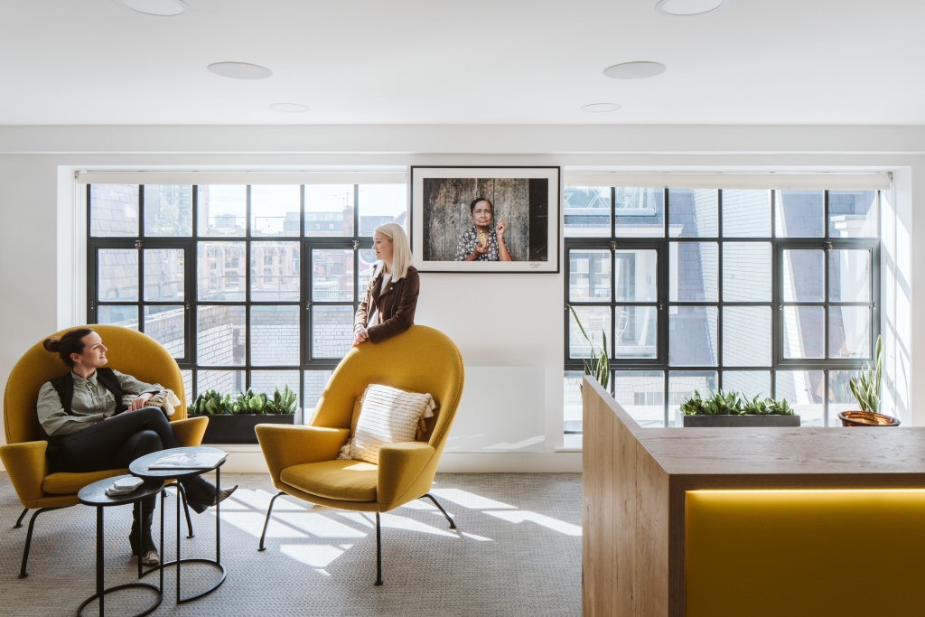
YELLOW
It’s no surprise that yellow is connected with joy, and optimism in colour psychology. All shades, whether it’s mustard, lemon or baby yellow, captures warmth and a sense of happiness.
Incorporating shades of yellow throughout your workplace will not only brighten up any darker areas and create feelings of positivity, but will also help to create a welcoming and engaging environment.
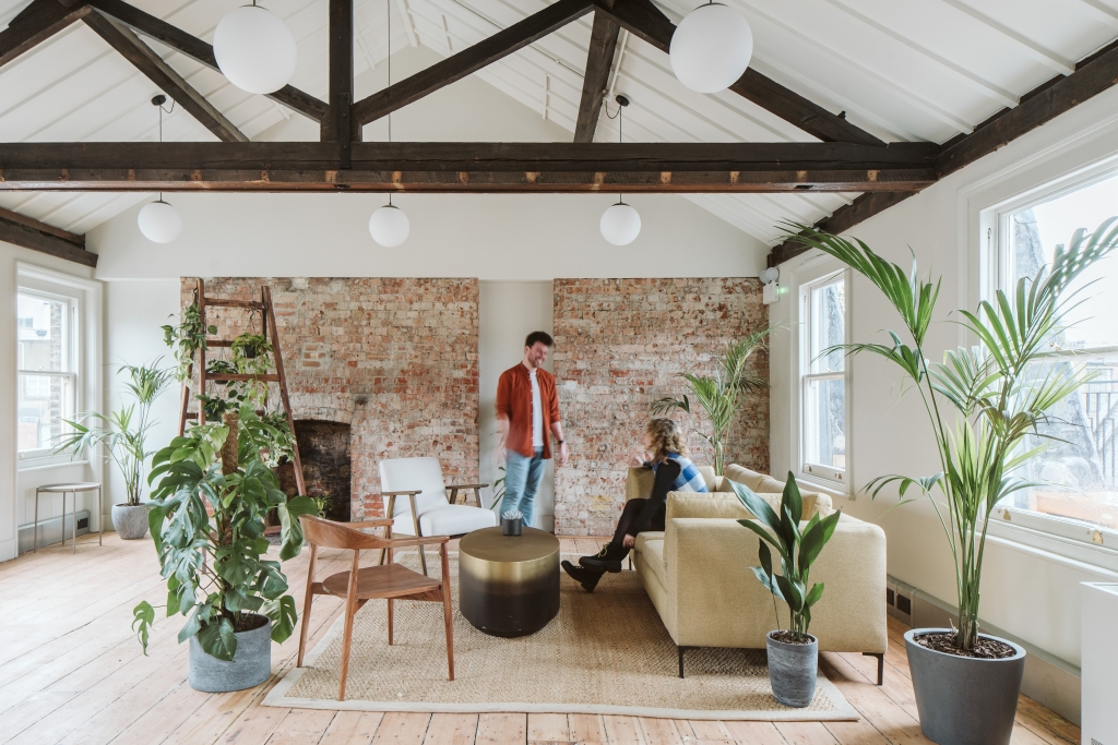
GREEN
Combining the invigorating quality of blue and the optimism of yellow, green is suitable for almost any area of the workplace. It is a colour commonly used in spaces where innovation and problem-solving are required as is suggested to help encourage and enhance productivity by reducing fatigue.
The easiest and most beneficial way of incorporating green into your workplace is through biophilia. Not only do plants offer many health benefits, they are also known to have anti-stress and anxiety properties, making them a necessity in every environment.
Lee Marley Breakout Area
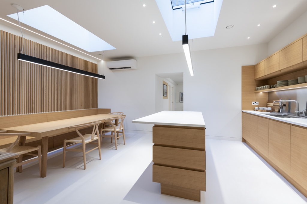
NEUTRALS
Shades such as black, grey, white and brown are vital to the interior designer’s palette. Their virtue lies in their flexibility – add colour to liven things up and remove it for a subtler aesthetic. Grey is one of those versatile colours that can be warm or cool, and can evoke feelings of calm and security. Black’s neutrality gives it a fail-safe quality and creates an elegance that results in power, drama and mystery.
Whether we like it or not, we are all surrounded by things that have been meticulously detailed, conceptualised, tested and produced by designers. How people react, respond, think and feel in a space can be easily influenced by the smallest details.
You may not be aware you are going through these motions, but somewhere, a designer has considered and cultivated that reaction, which is why office design plays a vital role in bringing the best out of your employees.
If you are looking to improve your workspace for both your business and people, get in touch with team today to see how we can help!